Shaping Cool Cities
An urban-heat study fusing Landsat thermal imagery, 3D building morphology, street networks and street-level computer vision across six European cities at 30 metre resolution, from my Bartlett MSc thesis: the model tests how much neighbourhood heat variation these sources explain together and where their relationships differ by city.
- Period
- 2024–present
- Status
- Ongoing research
- Role
- Researcher and developer
- Scale
- Six European cities
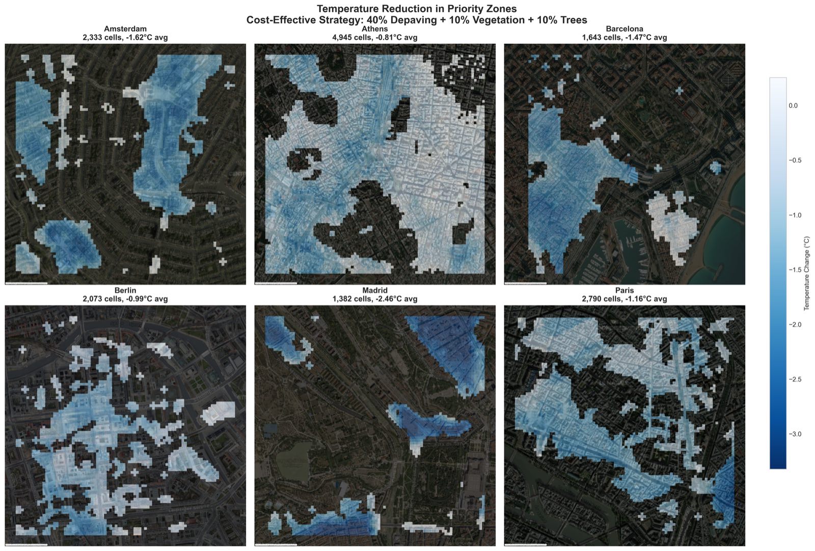
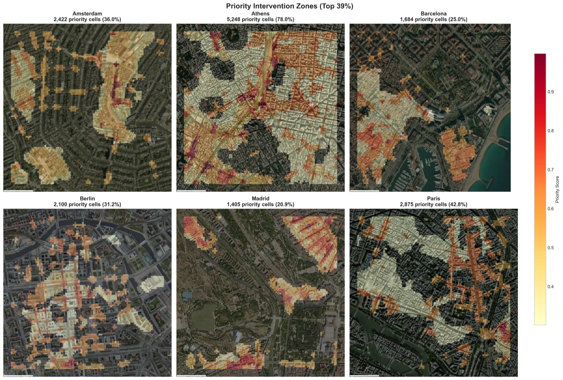 Open the full artefact in a new tab
Six-city exploratory priority-zone output from the bounded scenario workflow.
Source: Shaping Cool Cities project repository. Modelled screening output, not a measured intervention effect.Inspect full plate (opens in a new tab)Researcher and developer
- A six-city comparative study of Amsterdam, Athens, Barcelona, Berlin, Madrid and Paris at 30 metre resolution, integrating four source families in one reproducible pipeline.
- Spatial GroupKFold validation with 600 metre blocks, designed to keep neighbouring cells out of opposing train and test folds.
- SHAP-based interpretation showing that the mix and influence of surface, morphology, network and street-view variables vary by city; attribution is reported as predictive association, not intervention effect.
- A bounded scenario analysis and vulnerability-weighted priority map, published with the methodology and code so the assumptions and limits can be inspected.
This is an observational thesis, not a causal intervention study. The candidate radii and scenario bounds were chosen before modelling; the strongest tested de-sealing result occurred at the upper search bound, so it does not establish a non-linear threshold. SHAP importance is not an intervention effect, and the study did not run leave-one-city-out transfer tests or real-world before-and-after validation. The outputs are research hypotheses and screening priorities that require local testing.
The 2022 European summer caused more than 61,000 heat-related deaths, making it one of the continent's deadliest recent heat events, yet planners deciding where to plant, de-pave or spend a cooling budget get little guidance from the flood of satellite, 3D and street-level data now available. The problem was to fuse four incompatible data sources into one honest, interpretable model of where urban heat concentrates and why, comparably across very different climates and street forms.
My contribution
I built the full pipeline in Python. I extracted land surface temperature, NDVI and spectral indices from Landsat 8/9 through Google Earth Engine; derived sky view factor, solar irradiance and canyon geometry from voxelised building models (VoxCity); computed centrality, connectivity and demographic density from OpenStreetMap (Urbanity); and pulled greenery, enclosure and surface semantics from street-level imagery (GlobalStreetscapes), with EUBUCCO building footprints. I spatially integrated all of it onto a common 30 metre grid with theory-informed 150 metre and 300 metre candidate neighbourhood aggregations, then trained a hierarchical XGBoost model and inspected its feature attributions with SHAP. To reduce spatial leakage I validated with GroupKFold under 600 metre spatial blocking. A bounded scenario grid then explored how the fitted model responded to different de-sealing and greening inputs; it was hypothesis generation, not a causal intervention trial.
Decisions and constraints
Decisions I made
- Normalise four heterogeneous sources onto one comparable 30 metre grid and compare predefined local and neighbourhood contexts, while treating the tested radii as design choices rather than discovered physical scales.
- Choose an interpretable tree model with SHAP so predictive associations could be inspected, while keeping feature importance distinct from causal effect.
- Validate with 600 metre spatial blocks instead of a random split, accepting a more demanding test that reduces leakage between nearby observations.
- Compare six climates side by side rather than fit a single-city story, so geographic variation could be surfaced instead of smoothed away.
Operating constraint
A solo MSc thesis working only with open data, where satellite, 3D-voxel, street-network and computer-vision sources each differ in coverage, native scale and uncertainty, and where spatial autocorrelation quietly flatters any model that is not validated with care.
Claim boundary: This is an observational thesis, not a causal intervention study. The candidate radii and scenario bounds were chosen before modelling; the strongest tested de-sealing result occurred at the upper search bound, so it does not establish a non-linear threshold. SHAP importance is not an intervention effect, and the study did not run leave-one-city-out transfer tests or real-world before-and-after validation. The outputs are research hypotheses and screening priorities that require local testing.
What can be checked.
- A six-city comparative study of Amsterdam, Athens, Barcelona, Berlin, Madrid and Paris at 30 metre resolution, integrating four source families in one reproducible pipeline.
- Spatial GroupKFold validation with 600 metre blocks, designed to keep neighbouring cells out of opposing train and test folds.
- SHAP-based interpretation showing that the mix and influence of surface, morphology, network and street-view variables vary by city; attribution is reported as predictive association, not intervention effect.
- A bounded scenario analysis and vulnerability-weighted priority map, published with the methodology and code so the assumptions and limits can be inspected.
Documents, code and live work.
The case study states the claim. These sources let you inspect the underlying artefact in its original context.